Charts & Graphs Worksheet-4
-
See the following line plot to answer this question. How many cars were sold altogether in one week?
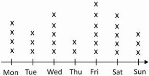
A. 25 B. 27 C. 28 D. 29
-
Which graph type is best for showing data that is organized in equal intervals?
A. Bar Graph B. Histogram
C. Line Graph D. Circle Graph
Try more maths practice tests
-
Which graph type would you select to show data which changes over time?
A. line graph B. bar graph C. histogram D. tally chart
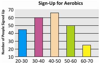
A community started an aerobics program for it's residents. The histogram below shows the number of various age groups signed up for the program.
-
Which age group showed least interest in aerobics?
A. 60-70 B. 40-50 C. 20-30 D. 30-40
-
Which age group showed most interest in the aerobics program?
A. 20-30 B. 60-70 C. 30-40 D. 40-50
-
How many 40-50 years old people signed-up for the aerobics program?
A. 65 B. 55 C. 60 D. 62
-
What type of graph is this?
A. bar graph B. circle graph
C. histogram D. line graph
-
How many people of all age groups signed-up for the aerobic program?
A. 220 B. 245 C. 350 D. 215
-
See the line plot to answer this question. How many people own two pets?
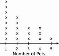
A. 3 B. 8 C. 5 D. 9
-
See the line plot below to answer this question. How many people own one pet?
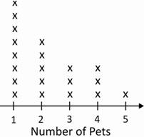
A. 7 B. 6 C. 3 D. 8
Answer Keys
(1)–C; (2)–B; (3)–A; (4)–A; (5)–D; (6)–A; (7)–C; (8)–B; (9)–C; (10)–D